How to Renew Logo Using Photoshop
Here's a little preview how logo "renewal" process usually works. We can also name it Logo Vectorization. A designer is usually provided the non-vector logo, often low in resolution, with the desired result to again have high quality logo for multi usage in web, print, etc.


I use River Spirit Casino logo as a reference here.
This is the original graphics provided. Looks sharp and clean at screen. Note that this is not too big in size - usable in web here and there, but definitely not usable for prints (except for business cards, when the logo is printed at very small size). The dimensions of the original logo is around 210x210 pixels, so in high quality (300dpi) print the logo would appear very small in size - about 0,7x07 inch (1,8x1,8 cm) small square.
The next step is to resize the graphics to a size acceptable for to re-create it with Pen Tool. Optimal size is actually a matter of taste, but maybe something fitting the screen 100% (so you can see actual pixels). You can later resize the logo anyway to any size, so for the work process, use the most comfortable size. Note that the more complex the graphics, the more it makes sense to use bigger size here. AND don't forget that if you are provided really small image for start (like this one here), it does NOT make sense to use too big size for the work process. So as you can see the sizes are already very relative.
Here's the graphics resized (upsized). Looks pretty ugly and jagged? This is why we actually need to re-create it - upsizing does not work in high quality without vector graphics used.
Let's start with the easier part of this - the lovely blue and green "flames".
You might use the smaller opacity for the provided screen to be able to track the edges of each logo element better.
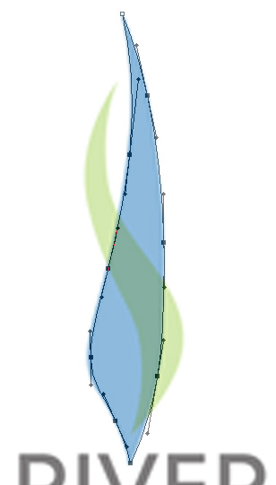
On the image above, all the "Path" points are selected, for better understanding how the curves and shape of the blue area is achieved. Once you discover the Pen tool in photoshop, you can't live without it - it is just so so usable.
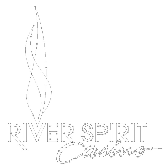
Here we go - below is how the vector graphics "wire frame" looks with the actual shape layers not visible. Not that there hundreds of "path points" in this simple logo - just to make everything in as high quality as possible, considering the provided original image.
Let's take a look how it looks with the new shapes.
Now let's make the "shape edges" and "convert points" invisible..
This is it! A completely new one based on the small file provided. All the edges razor sharp, all the elements as layers! Lot's of flexibility and freedom for any further logo related requirement.
The image below is just an example of what is the freedom after you've made the hard job. Place it all around, rotate the text, resize any element or add effects to them - now you can have every kind of fun with your newly created artwork :-)
This one below is with the "drop shadow" effect - probably one of the most used effects in photoshop.
The next is part of the enlarged preview of the logo - as you can see, all the edges are still razor sharp, so it really IS a vector image you have created.
Well what's next? Are we all done? Not yet. Once the logo is vectorized, it is nice to create a batch of files for multi usage for it. A couple of different sized web files (jpg, png), say, starting from tiny 50x50 pixel to a huge 100 megapixel image. And, the vector formats themselves - you can use pdf and eps for this purpose. This is it :-) You're all done. Zip all the files you have and you have a nice one-file unit with all the needed content.
-------
Bottom word. Note that photoshop is used for this type of the project. You should also consider using special vector-format aimed programs such as Adobe Illustrator - there are lots of more advanced options for vector graphics than in photoshop, which may make take the whole working experience with vector graphics into a whole new level.
posted by bright at 7:49 PM
![]()


0 Comments:
Post a Comment
<< Home